My (very non-technical) friend asked me to edit a screenshot for him. Nothing too hard: it’s an image of a flyer for a previous event, and he lost the original. A few words and numbers in it needed amending. I was like, “Sure, man. Come over, we’ll do it on my laptop in a couple of minutes.”
Easy, right?
He comes over, sends over the screenshot. I take a look and it looks really simple. I can do that, no sweat. Looks like Helvetica. I launch Gimp, erase the parts that need amending and type in the new text. …
Failing
Ah, wait. The font doesn’t look right. It looks very much like Helvetica, but not really. Let’s try Arial. No…. man… Also, there are some serifs in the screenshot.
I’ll ask Google for similar fonts. Okay… Maybe it’s an open-source one? Shit… no.
Meanwhile, my friend says “I don’t see the problem, the first one was great. Actually, they all are”. But, obviously, he is wrong - it is not the same font.
Oh no! Now I see that different parts of the text are using different fonts. This is a nightmare.
Okay, that was silly of me — I should just ask Gemini what this font is. I cropped the text area I want to replace and I’ll send it over to Gemini!
Here we go:
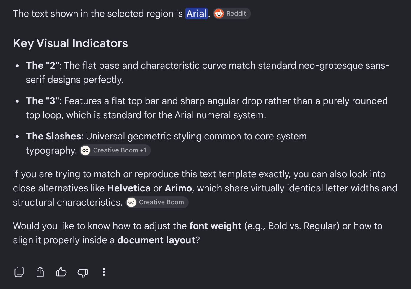
I guess Gemini went with Arial first. Okay, I can redirect it:
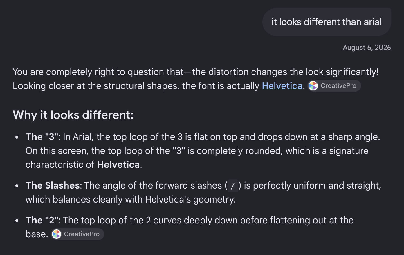
NO GEMINI!!
Why are they so bad, when they can be so good at so many other things 😭
At this point my friend and my wife are completely rolling their eyes at me: “Just use the first one, it’s fine”.
NO!
I need the right tool. And, evidently, LLMs are too large, I bet there are services on the web that just do that.
*google search...*
Got a bunch of them (Adobe Fonts, YoFont, etc.). Let me try a few; this will work for sure.
AHHH SO MANY ADS!
One says Avenir. Nope.
Another says Georgia. Nope.
There was a compounded problem here: my input had low resolution and murky antialiasing, the sites clearly wanted to prioritize selling commercial fonts, and I was drowning in banners.
(In hindsight, one tool actually did list the correct font, but it was buried near the bottom of the suggestions with negligible confidence, so I missed it).
I know what is the right tool here: convolutional neural network — CNNs are excellent with visual input.
Building the tool
Building a CNN is really easy today. After years of optimizing framework APIs and implementations, it is very easy to create and use a CNN even on my little MacBook. I also know what the (synthetic) dataset looks like: the resolution, the text, etc. Easy peasy.
A couple of prompts, and we’re done.
First, a rough design:
Our goal is to create a Python script that uses a local neural network to identify font and style from a PNG file (black font, white background) - the font photo.

The output of this session will be a set of prompts to provide to an LLM Coding Agent.


To achieve that, we'll need a few components:
....
....
Okay, we got some good ideas here. I’ll redirect and make some decisions. Maybe a few clarifications. Let’s talk about specific steps:
- Generating a synthetic dataset of input images for a folder of input font files.
- Oh, we’ll need to use a large set of fonts. Google Fonts is a good source, I guess. We also need a script to download those fonts.
- We want another script to take an image as input and output the desired format (1 channel greyscale, resized to normalized resolution, and output as a
FloatTensornormalized to [0.0, 1.0]) - We want to train our CNN. So, generate another script that uses PyTorch to train a multi-head font and style classifier (oh, yeah, what is the topology?)
This is interesting; all those terms and concepts are coming back: multi-task heads, backbone, loss functions, etc 💞
At this point, my friend has already gone home, my wife is watching a show, and I am ready to train my CNN.
Running
Okay, downloading takes a few minutes.
Now, generating the synthetic dataset. That takes a while, sure…
An hour later
Mmm, still generating…
An hour later
Oh… still working. Mmm.
30 minutes later, still 1%
This is slow… Ooooh, I have like a few thousand fonts. Okay, gotcha. Let’s limit it to the top 400 most popular fonts.
A simple query to Google’s Webfonts: https://www.googleapis.com/webfonts/v1/webfonts?sort=popularity&key=YOUR_API_KEY gives us JSON.
A bit more prompting, and our script can generate a synthetic dataset for those 400 fonts.
python3 generate_dataset_v2.py \
      --fonts_dirs downloaded_fonts \
      --popular_json popular_400_fonts.json \
      --output_dir dataset_top400_v2 \
      --samples_per_template 5 \
      --workers 12
This time, generating the dataset is faster. Seems like it will be about 10 minutes.
⏳
Next, let’s train our CNN:
python3 train.py \
      --manifest_csv dataset_top400_v2/dataset_manifest.csv \
      --output_dir runs/top400_v2_15ep \
      --epochs 15 \
      --batch_size 64 \
      --lr 1e-3 \
      --num_workers 6
After the first epoch (which took 7 minutes), we have:
Epoch 01/15 [445.9s] Train Loss: 3.4890 | Val Loss: 1.9134 | Val Font Top-1: 65.24% | Val Font Top-3: 85.36% | Val Style Top-1: 91.98% | Val Joint Acc: 60.46%
Basically:
Val Font Top-3: success rate in having the correct font appearing among top three predictions <- frankly, all I care about.Val Style Top-1: success rate in getting the style (bold, italic, normal, etc.) correct.Val Joint Acc: success rate where both are correct.
Epoch 2:
Epoch 02/15 [398.7s] Train Loss: 1.7443 | Val Loss: 1.3207 | Val Font Top-1: 81.85% | Val Font Top-3: 95.25% | Val Style Top-1: 93.73% | Val Joint Acc: 76.74%
Okay, that’s really nice: 95.25%
… … …
Epoch 15:
Epoch 15/15 [404.9s] Train Loss: 0.6673 | Val Loss: 0.6321 | Val Font Top-1: 97.16% | Val Font Top-3: 99.39% | Val Style Top-1: 99.59% | Val Joint Acc: 96.78%
PERFECT
Font detecting
We have a trained network with a 99% success rate — I’m so excited to try it out 🤗
python3 predict.py \
      --image images-to-detect/screenshot.png \
      --model_path runs/top400_v2_15ep/best_model.pth \
      --font_map dataset_top400_v2/font_map.json \
      --style_map dataset_top400_v2/style_map.json \
      --top_k 5
In seconds, I get:
  ✦ Primary Font   : Teko (15.9% confidence)
  ✦ Inferred Style : Regular (100.0% confidence)
────────────────────────────────────────────────────────────────────────
  TOP FONT CANDIDATES:
  Rank  | Font Family                | ID   | Confidence | Distribution
  ────────────────────────────────────────────────────────────────────
  #1    | Teko                       | 363  |  15.9%   | [██░░░░░░░░░░░░]
  #2    | Libre Bodoni               | 193  |  11.5%   | [██░░░░░░░░░░░░]
  #3    | Noto Color Emoji           | 229  |   5.8%   | [█░░░░░░░░░░░░░]
  #4    | Smooch Sans                | 344  |   5.5%   | [█░░░░░░░░░░░░░]
  #5    | Bodoni Moda                | 59   |   4.9%   | [█░░░░░░░░░░░░░]

  STYLE PROBABILITY DISTRIBUTION:
   ★ Regular      : 100.0%  [██████████████]
     Bold         :   0.0%  [░░░░░░░░░░░░░░]
     Italic       :   0.0%  [░░░░░░░░░░░░░░]
     Bold-Italic  :   0.0%  [░░░░░░░░░░░░░░]
────────────────────────────────────────────────────────────────────────
Oh… that’s low confidence 😕
Plus, none of those is the font from the screenshot.
After a short consultation with Gemini (I used Google Fonts, but my CNN can't detect the actual font....): it is likely because the font is a proprietary font which Google Fonts does not have.
Adding more sources to the font set
Okay, we also need to use the fonts macOS has (they ship a bunch of proprietary fonts under /System/Library/Fonts/ - more on that in the technical section below). A bit of prompting, revised the dataset generation script, and ran it again.
While I was looking at the code, I realized that digits are not represented in the dataset in a sufficient way. So I fixed that, too.
python3 generate_dataset_v2.py \
      --system_fonts_only \
      --output_dir dataset_macos_v2 \
      --samples_per_template 5 \
      --workers 12
Now train (this is a much smaller set, only ~200 fonts, so it will likely be a faster run):
python3 train.py \
      --manifest_csv dataset_macos_v2/dataset_manifest.csv \
      --output_dir runs/macos_v2_15ep \
      --epochs 15 \
      --batch_size 64 \
      --lr 1e-3 \
      --num_workers 6
Epoch 1:
Epoch 01/15 [128.9s] Train Loss: 3.7313 | Val Loss: 2.8855 | Val Font Top-1: 32.55% | Val Font Top-3: 52.81% | Val Style Top-1: 89.57% | Val Joint Acc: 27.31%
Much faster.
… …
Epoch 15:
Epoch 15/15 [128.4s] Train Loss: 0.8033 | Val Loss: 0.8114 | Val Font Top-1: 88.49% | Val Font Top-3: 96.20% | Val Style Top-1: 99.90% | Val Joint Acc: 88.38%
Lovely! 96.2% success rate.
And predicting with the new CNN:
python3 predict.py \
      --image images-to-detect/screenshot.png \
      --model_path runs/macos_v2_15ep/best_model.pth \
      --font_map dataset_macos_v2/font_map.json \
      --style_map dataset_macos_v2/style_map.json \
      --top_k 5
Got me:
────────────────────────────────────────────────────────────────────────
  ✦ Primary Font   : Bodoni 72 Oldstyle (29.1% confidence)
  ✦ Inferred Style : Regular (100.0% confidence)
────────────────────────────────────────────────────────────────────────
  TOP FONT CANDIDATES:
  Rank  | Font Family                | ID   | Confidence | Distribution
  ────────────────────────────────────────────────────────────────────
  #1    | Bodoni 72 Oldstyle         | 22   |  29.1%   | [████░░░░░░░░░░]
  #2    | Bodoni 72                  | 21   |  28.5%   | [████░░░░░░░░░░]
  #3    | Marion                     | 76   |  23.5%   | [███░░░░░░░░░░░]
  #4    | Bodoni 72 Smallcaps        | 23   |   8.7%   | [█░░░░░░░░░░░░░]
  #5    | AppleMyungjo               | 6    |   1.6%   | [░░░░░░░░░░░░░░]

  STYLE PROBABILITY DISTRIBUTION:
   ★ Regular      : 100.0%  [██████████████]
     Bold         :   0.0%  [░░░░░░░░░░░░░░]
     Italic       :   0.0%  [░░░░░░░░░░░░░░]
     Bold-Italic  :   0.0%  [░░░░░░░░░░░░░░]
────────────────────────────────────────────────────────────────────────
Ha!!! Bodoni 72 looks like the correct font. My network did it.
Let’s try the second font:
────────────────────────────────────────────────────────────────────────
  ✦ Primary Font   : Didot (88.2% confidence)
  ✦ Inferred Style : Regular (100.0% confidence)
────────────────────────────────────────────────────────────────────────
  TOP FONT CANDIDATES:
  Rank  | Font Family                | ID   | Confidence | Distribution
  ────────────────────────────────────────────────────────────────────
  #1    | Didot                      | 39   |  88.2%   | [████████████░░]
  #2    | Cochin                     | 31   |   4.9%   | [█░░░░░░░░░░░░░]
  #3    | AppleMyungjo               | 6    |   1.4%   | [░░░░░░░░░░░░░░]
  #4    | Savoye LET                 | 105  |   0.8%   | [░░░░░░░░░░░░░░]
  #5    | Baskerville                | 19   |   0.5%   | [░░░░░░░░░░░░░░]

  STYLE PROBABILITY DISTRIBUTION:
   ★ Regular      : 100.0%  [██████████████]
     Bold         :   0.0%  [░░░░░░░░░░░░░░]
     Italic       :   0.0%  [░░░░░░░░░░░░░░]
     Bold-Italic  :   0.0%  [░░░░░░░░░░░░░░]
────────────────────────────────────────────────────────────────────────
Yes!! Didot looks quite right!
🤗
Unbelievable.
Epilogue
I edited the screenshot with the detected fonts. Sent it to my friend, who said, “Thanks. You’re insane.” Yeah, whatever!
I was happy and excited, so I decided to show off to my family. My wife was proud, I believe.
Then I went to my daughter.
Me: “Hey Netta, check it out. My friend wanted me to edit this screenshot text and I needed to figure out the right font for this text. And…“
Netta, cutting me off: “Yes, it’s Times New Roman. Regular.”
Me: …..
*running to my laptop, checking with Gimp, realizing she is 100% correct.*
Evidently, the correct tool for this job is a person attending an art school.
The code
You can check out the code here: https://github.com/menny/fonts-cnn.
If you want a super good font detector, you can reach out and I can ask my daughter.
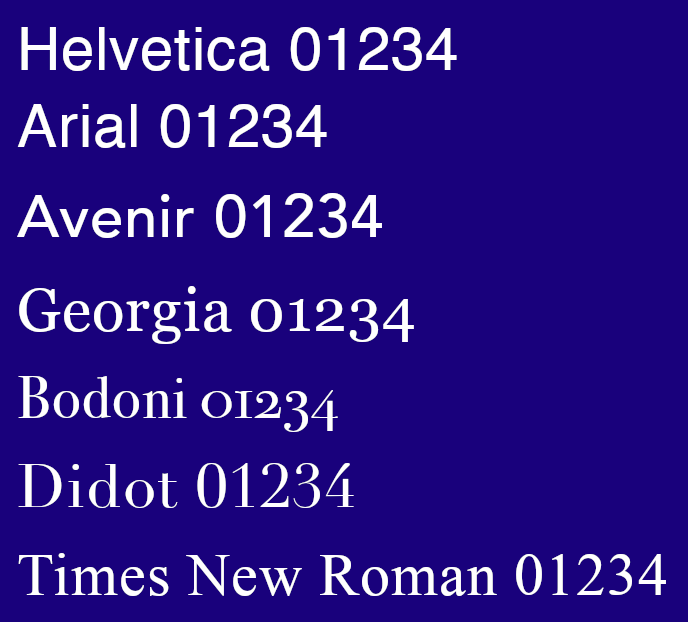
The detected fonts comparison
Here is a sample of the fonts that were detected. Including the actual Times New Roman.
Technical
In this post I quickly glanced over technical details and decisions, mostly because I just wanted to show that picking the right tool — not necessarily the largest or most complex — is what matters. Joking aside, we achieved a remarkably accurate visual recognition pipeline using a compact CNN trained entirely on a laptop GPU in under 30 minutes.
Here is a look under the hood at the architecture, the synthetic data engineering, and why the model behaved the way it did.
1. The Multi-Task CNN Architecture
Why use a CNN here rather than a multimodal LLM or Vision Transformer (ViT)? Typography identification is fundamentally about local geometric invariants: stroke curvature, stem weight, serif brackets, terminal spurs, and x-height ratios. Convolutional kernels possess a natural spatial inductive bias for these localized edge transitions without requiring billions of parameters or vast pretraining corpora.
The network topology is implemented in MultiHeadFontCNN in train.py:
- Shared Feature Backbone: A 5-stage convolutional feature extractor. Each stage applies
Conv2d(kernel 3×3, padding 1, bias=False) →BatchNorm2d→ReLU→MaxPool2d(2), doubling feature channels at each step from 32 → 64 → 128 → 256 → 512. Stages 4 and 5 include spatialDropout2d(0.15)to prevent co-adaptation of complex spatial features. - Adaptive Bottleneck: An
AdaptiveAvgPool2d((4, 4))compresses arbitrary spatial activations into a fixed 512 × 4 × 4 = 8,192-dimensional representation, followed by a dense projection to 512 embedding dimensions (Linear→BatchNorm1d→Dropout(0.4)). - Dual Classification Heads: The shared 512-D embedding branches into two separate task heads:
- Font Head: Linear projection from 512 → N font families (N=400 for Google Fonts, N=130 for macOS system fonts).
- Style Head: Linear projection from 512 → 4 discrete style categories (
Regular,Bold,Italic,Bold-Italic).
- Multi-Task Loss Balancing:
Total Loss = CrossEntropy(font_logits, targets, label_smoothing=0.05) + 0.5 * CrossEntropy(style_logits, targets)Label smoothing (0.05) on the font head is essential: typography families often have nearly identical geometric siblings (e.g. Arial vs. Helvetica or Didot vs. Bodoni). Smoothing prevents the softmax logits from exploding into overconfident probability distributions.
- Optimization & Hardware:
Trained with
AdamW(lr=1e-3,weight_decay=1e-4) and aCosineAnnealingLRschedule using Apple Silicon Metal Performance Shaders (device='mps'). Training 15 epochs took ~30 minutes for the macOS dataset (128s/epoch) and ~110 minutes for 400 Google Fonts.
2. Synthetic Data Engineering & “Tofu” Filtering
Training a font recognizer without thousands of labeled real-world photos requires synthetic data. However, generating synthetic patches with naïve rendering quickly exposes edge-case failure modes:
- The “Scale Blow-up” Bug in v1:
In early iterations, rendering short numbers (like
42or dates) scaled text to fill the 256 × 256 canvas. A two-digit number blew up into massive, 180-pixel-high glyphs that bore no resemblance to real document typography. Ingenerate_dataset_v2.py, this was solved by:- Introducing balanced multi-line digit grids (
TEMPLATES_NUMBER_MATRICES), ensuring complete numeric glyph representation (0–9) in realistic groupings. - Adding scale-clamped rendering, constraining glyph heights to a natural 28pt–42pt scale.
- Introducing balanced multi-line digit grids (
- Eliminating Missing-Glyph “Tofu” Boxes via
cmapVerification: Scanning standard OS directories like/System/Library/Fonts/uncovers nearly 400 font files. However, nearly half are symbol fonts (Webdings, Wingdings), color emojis (Apple Color Emoji), Braille fonts, or non-Latin scripts (Arabic, Hebrew, Devanagari, CJK). If fed directly to the renderer, Pillow outputs blank boxes or.notdef“tofu” boxes ([?]). If labeled as that font, the CNN would learn that a blank box or tofu rectangle means Arabic or Emoji! To solve this,check_font_printable_coverageparses each font’s binarycmaptable usingfontTools.ttLib.TTFont. Any font lacking glyph mappings for the required ASCII alphanumeric and punctuation set is filtered out before dataset creation. For rare glyphs (like€), an automatic fallback to$ensures no tofu artifacts pollute the dataset. - Print & Scan Nuances:
Real-world screenshots and scans aren’t mathematically crisp vectors. In
render_patch, random padding offsets (2–8px), subtle Gaussian blur (0.1–0.4px), and threshold dithering were injected to simulate authentic rasterization and ink spread without degrading fine serif traits.
3. Out-of-Distribution Predictions: Why Bodoni and Not Times New Roman?
The final comedic punchline—where the CNN guessed Bodoni 72 and Didot, while Netta correctly identified Times New Roman—illustrates a core principle of machine learning:
-
Closed-Set Estimation (and the macOS Supplemental Gotcha): Discriminative CNN classifiers are closed-set estimators: their final layer is a softmax distribution across known training classes. If a font isn’t in the dataset, the network cannot predict it.
In our first run (Google Fonts), Times New Roman was simply not in the catalog. But what about the macOS run? As it turns out, on modern macOS, standard document fonts—including Times New Roman—are tucked away inside
/System/Library/Fonts/Supplemental/, whereas/System/Library/Fonts/mostly contains system UI fonts. Because my dataset script only scanned the top-level directory, Times New Roman was never in the training set!The network wasn’t failing; it was doing the best it could with the universe it was given, finding the closest visual relatives (the high-contrast serifs of Bodoni 72 and Didot).
- Didone Serifs and Feature Proximity: When retrained on macOS fonts, Bodoni 72 and Didot topped the rankings. From a pure geometric feature standpoint, the network was picking up on the exact right visual family: high stroke contrast (dramatic contrast between thick vertical stems and razor-thin hairlines) and unbracketed horizontal serifs. In the feature space of the 512-D embedding, Bodoni and Didot sat right adjacent to the target sample.
- CNN Edge Detectors vs. Human Holistic Perception: The CNN looks at local edge gradients, stroke thicknesses, and localized pixel statistics. Netta, having studied typography and visual design, looked at the whole text holistically: proportional balance, historical typeface conventions, and context. A human brain integrates semantic and visual context in milliseconds, whereas a specialized neural net remains bounded by its training distribution and loss function.
Machine learning gave us a remarkably capable, lightweight tool built from scratch in an evening. But domain expertise (and an art school student) is still the best tool in the shed.
Discussion
blog comments powered by Disqus