I'm working on a new feature for AnySoftKeyboard, where it will 'hint' the user about what lays behind long-pressing a key.
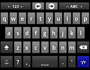
I've decided that the best UX I can provide, is to draw a small character, at the bottom-right corner of the key, showing the long-press output, or "..." in case there are lots of them. It will probably look like this:

So, I had to figure out how to position the character there. Java/Android provides a nice service called FontMetrics, which provide general metrics on the font, like what is the tallest glyph (character), lowest glyph, etc.
Since the hint is very small, I had to make sure the position is precised. So I've dived into the definitions of those metrics,
and their values, and cooked up a small Android app which
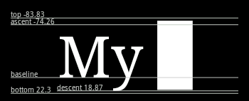
visualizing the metrics, and since an image is worth 37.5 tweets, I give you a screenshot:

Here is FontMetrics in layman lingo:
- baseline: the base of your font drawing. Your text will be drawn ABOVE this X.
- top: the maximum distance above the baseline for the tallest glyph. Since it is ABOVE the baseline, it is a negative value!
- ascent: this is the recommended space above the baseline you should make for a line of this text. Again, above the baseline, so negative.
- descent: this is the recommended space below the baseline you should keep for text, since some characters (e.g, y) are drawn some below the baseline.
- bottom: this is the lowest glyph space below the baseline.
- leading: I haven't included that in the image (or the app) since it is usually 0. But, to make the post complete, leading is the recommended extra space to add between two line of text. I think that the reason that it is usually defined as none, is because bottom (or top) takes care of the extra space needed.
Discussion
blog comments powered by Disqus